Pasieka Lubomin(Lubomin Apiary)
Nestled in the Mazovian countryside, a place friendly to both people and bees was born – Pasieka Lubomin. The main goal of the visual identity was to distinguish the newly created brand from others in an already saturated market and create an image that is both friendly and elegant – associated with the quality of products offered by the apiary. The honey is obtained with respect for the bees and with consideration for the well-being of people who benefit from their work. It is not contaminated with commonly used antibiotics, making it safe for use in apitherapy.
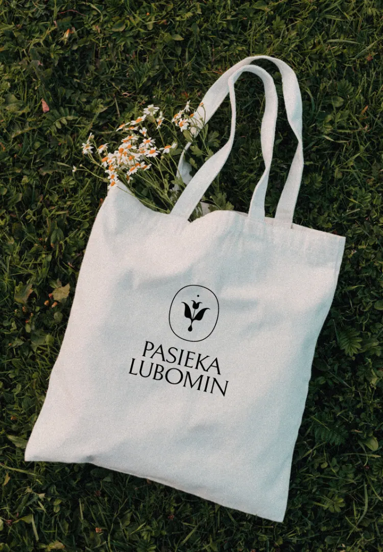
The logo design incorporates the symbolism of the honey-making process – a bee over a flower cup with a drop of liquid honey flowing from the plant. The symmetrical composition is enclosed in an oval, referencing tradition.
In the label design, we focused on readability and contrasting typography. Unlike the image of most similar products offered on the market, the labels are both simple and modern, effectively departing from the common 90s aesthetic. Their color scheme emphasizes the individual character of each type of honey, making the products stand out on the shelf.
Pasieka Lubomin – honey for the heart.
services
Visual Identity
Packaging